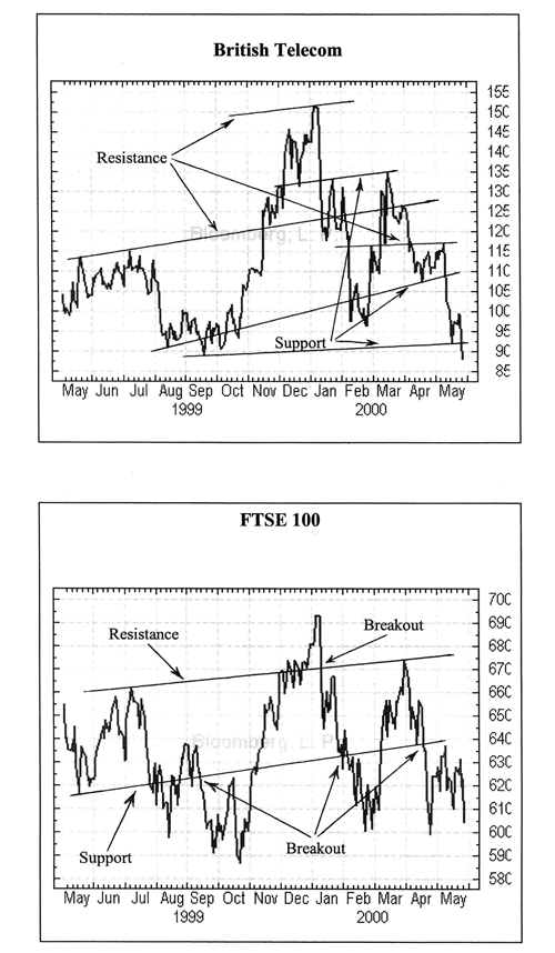
The basic, and probably most reliable charting technique is a process where you determine the trendlines as a series of lines that connect highs and lows within a trend. These lines can then offer support or resistance to a market.
Support is a level at which a market can reach but can’t fall below. Resistance is a level at which a market can reach but can’t rise above it. The space that’s between the support and resistance lines is known as a channel, giving rise to channel theory – more about this next.
Looking at the example of British Telecom shares, you’ll see that they are in a downward trend. If the trendlines were horizontal then it is said the market would be consolidating.
Once a trend becomes obvious, then there are a number of ways in which you can profit. The most popular option is simply to trade in the direction of the market, but taking a medium-term view.
Another way is to trade against a trend. Instead of following the markets, you go the opposite way as you expect there to be a significant change in direction and you’ll already be ahead of the crowd. This will be done by taking a long-term view.
There are also a whole series of trends within a long-term trend each with their own resistance and support levels.
But what if the trend channel is broken?
A breakout, as it is commonly known, occurs when the market moves outside a trend channel. This is usually followed by a significant change in prices.
Back to the example : Between May and July we marked the resistance and support lines for the rest of the year. Then in the middle of July the price fell below the support line and continued to fall sharply until it bottomed out in September. Gradually the price began to make ground and by December the price had reached an all time high of around the £15.00 mark.
With the BT chart you can clearly see a trend beginning in October where the share price climbed throughout October, November and December. We’ve also applied the same trendlines to the chart for the entire FTSE 100.

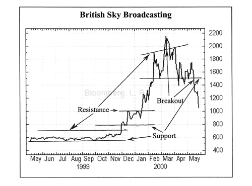
You can also have trends within trends. Look at the British Sky Broadcasting chart :

The resistance and support lines were marked in May 1999. By November 1999 new resistance and support lines were drawn. Once these trendlines are broken, new trendlines appear.
The breakout points have been marked on the above example and you’ll see that after the breakout occurred, there was a significant move in price.